Streamlining Forms Management at Scale
A complete redesign of the digital forms ecosystem to reduce staff workload and improve patient access.
I. Introduction
In this age of self-driving cars and AI assistants, over 50% of dental offices in the US still use paper forms.
What’s worse? Some of those dental offices choose to use paper – because the forms features included in their digital patient management systems don’t work for them.
Yeah, our forms product needed a complete makeover.
Project Background
Henry Schein One is the market leader in dental software, offering a wide range of products to help over 35,000 dental providers manage their practices, provide better treatments, and communicate with their patients.
I joined the Patient Experience team to spearhead the high-priority Patient Forms initiative, and stepped into the primary UX designer role, leading design strategy and supporting in research efforts across the greater product team.
ROLE
UX Designer & Researcher
PROJECT TEAM
1 UI Designer, 2 Product Managers, 6 Engineers
TIMELINE
Q3 2024 to MVP; ongoing
TOOLS
Figma
HeyMarvin AI
Lyssna
II. Problem Space
First and foremost, I needed to understand the existing forms offerings.
I was able to dig through records of user feedback received over the years, from support call transcripts to facebook group comments. I also initiated conversations with solutions consultants, software trainers, and product managers within the company to help paint the big picture:
Why are forms such a hot topic at HS1?
My takeaways:
User Impact: A forms solution that is well-tailored to dental needs will save our users significant time and effort from handling printouts that take up appointment time and lead to delays.
Strengthen our Product Suite: HS1’s Practice Management Systems (PMS) are already market leaders in the dental space, but an integrated forms solution would become a key differentiator that is difficult for competitors to mimic.
Research
Existing Usage Data
Access to historical usage data from our legacy products would be invaluable to a such a large-scale redesign project. However, the legacy systems tracked data poorly, and left us with little to work with:
48.2% completion rate
74.6% PMS sync success rate*
59% of patients access forms on a mobile device**
18%of patients access forms on an in-office tablet
*Sync success rate measures how reliably our system can populate the correct fields in the PMS using data we collect from forms.
**Patients used mobile devices even when the page rendered poorly on small screens.
Stakeholder Interviews
We interviewed office managers across a spectrum of dental practices from independent clinics to nationwide Dental Service Organizations (DSOs).
Small practices demonstrated greater operational flexibility but lacked time to build forms from scratch. In contrast, DSOs manage forms at scale across hundreds of locations, balancing corporate clinical and legal standards with varying state regulations, insurance requirements, and local needs.
We also spoke with internal experts, including software trainers and support staff, to understand recurring workflow issues and user pain points. These conversations validated key assumptions and reinforced the business value of improving the forms experience.
Users & Insights
Our primary users are dental office staff responsible for creating compliant patient forms, distributing them efficiently, and managing responses to support patient and provider safety, all under tight time constraints. These needs are consistent across both independent practices and large DSOs, where efficiency directly impacts staff capacity and revenue.
Our users also serve a secondary audience: patients. Feedback and surveys show patients prioritize forms that are quick to complete, easy to understand, and clearly communicate critical information to their providers.
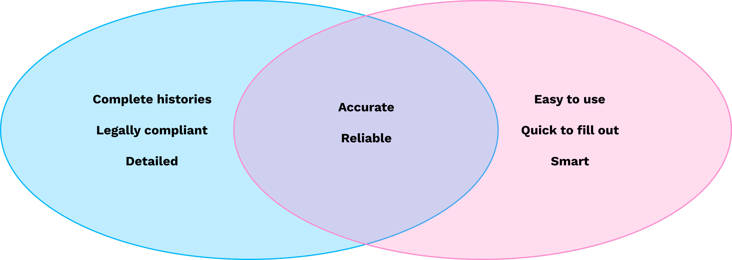
Practices (left) & Patients (right): Two user groups who conflict in wants, but both need complete and accurate data collection to ensure a successful dental visit.
The Challenge
Dental office staff need a way to manage digital patient forms efficiently, but legal constraints and system fragmentation make it difficult to meet both operational and patient expectations.
How do we streamline dental form workflows to reduce staff burden and ensure compliance, while delivering a fast and simple experience for patients?
Key Pain Points
Visualization of what used to be the forms user flow.
For office staff, although the old form builder offered a lot of customizability, it had a clunky interface that relied on users to work around its eccentricities.
Each form had complex settings and sending mechanisms that followed convoluted backend rules not reflected in the interface. Furthermore, every single form submitted needed to be synced to the PMS manually by staff, with a success rate below 75%.
These inefficiencies forced staff to spend valuable time on administrative work instead of supporting patients and providers, ultimately slowing operations, increasing the risk of data issues, and resulting in lost revenue from delayed or incomplete patient intake.
What the forms manager (and its many error states) used to look like.
For patients, the outdated UI was not responsive to mobile screens and threw errors that prevented users from submitting forms. Many patients complained that even though they have been going to the same dentist for years, they are always asked to fill out information the office should already store.
If patients are not enabled to complete their forms ahead of their appointments, they are left to do so in the office during their appointment time, often leading to incomplete information and appointment delays.
What patient forms used to look like (desktop).
Competitive Analysis
I conducted a competitive analysis on a range of products such as GoogleForms, Mailchimp, Jotform, and more to get a sense of industry standard practices as well as innovative solutions. I used a competitive analysis matrix to synthesize my findings and list key learnings and opportunities to inform my designs.
Since our product was so outdated, this was an important step to make sure that our new implementation would not only meet modern expectations but be scalable for the future.
PMS System Limitations
Behind form distribution and completion lies a complex PMS data layer that must reliably support writeback. To serve all HS1 customers, the solution needed to integrate with both Dentrix (on-prem) and Dentrix Ascend (cloud).
The two products have little in common beyond their names, requiring separate writeback pipelines and distribution workflows. All of this complexity had to be abstracted into a single, unified frontend designed to support the long-term goal of migrating customers to the cloud.
Problem Definition
The large scope of this initiative makes it all the more important for me to focus and define the specific problems to solve for. I grouped the problems into the two distinct users of the product to align with their goals.
For Practices, how might we…
…Reduce time and complexity in managing forms?
…Collect more accurate data?
…Offer a more seamless user experience with the PMS?
…Nudge users towards better operational practices?
For Patients, how might we…
…Make forms faster and easier to complete?
…Offer more inclusive and accessible forms?
…Balance data security and user convenience?
This intersection presented an opportunity to design a forms system that is flexible for practices but intuitive and efficient for patients. It also lays the foundation for a smarter and seamless patient experience suite within the practice system umbrella.
III. Solution Space
To address the goals outlined in the problem space, I explored solutions through both structural changes to the form builder and UX improvements for patient-facing forms.
Ideation & Design
Integrated Forms Manager
The Forms manager and builder was a hugely complex problem to solve from the beginning, with a spreadsheet’s worth of requirements and significant technical and time constraints, design and engineering needed a smart strategy.
I began with some concept sketches to use as starting points for discussion with my PM and engineers. This is to ensure concept viability from the start so as to not waste time designing unfeasible solutions.
We eventually decided to use a form builder framework as a base, on top of which we can implement customizations and integrations with the PMS. While a fully custom UI might offer more flexibility, we opted for a scalable form-builder pattern that supported reusable templates, saved engineering time, and aligned with our PMS integration strategy.
Early sketches for the form builder.
The landing page enables practice managers to view and organize their forms, usage data, and filter based off of practice locations and patient types.
After significant iterations where I explored concepts like packets and instances, I opted for an architecture that would allow us to scale and add more filters as needed, but didn’t overwhelm users with too many views or options.
The builder empowered users to build either from scratch or from one of our recommended templates. With built-in conditional logic and forms fields that sync directly to the PMS, office staff could customize their forms as they like while enjoying the seamless read/write functionalities for every patient in their system.
Patients would receive a link to their forms in their text messages or email, and be able to fill out their forms before the appointment. For patients who have not or are not able to do so, I designed an in-office kiosk access point, where the practice can set up a tablet for a more traditional patient intake workflow.
Chairside Review
During an appointment, the provider reviews the patient’s forms with them to confirm their medical conditions, allergies, and medications. If a patient indicates a change, an edit is made to their health history and signed by both the patient and the provider.
This piece of the workflow lives within the two PMS’s, so I collaborated with the designers on our Dentrix and Ascend teams to conduct interviews and iterate on designs that would connect well with the forms manager and fit into the PMS systems respectively. Since the two PMS’s are quite different, the design process needed to occur separately to achieve the same goals.
Chairside Review in Dentrix: Both the patient and the provider’s signatures are captured when a change is made to the health history that differs from the form.
New Patient Experience
With a better understanding of our users and their users’ pain points, I proceeded to sketch and wireframe some initial ideas for the patient-facing experience. My goal here was to visualize elements that would directly solve for the pain-points identified previously, and outline the separate paths taken by new vs. existing patients.
The process helped me conceptualize the overall experience, and evoked new issues and ideas to consider, such as an interactive navigation menu and its various states.
Sketches and lo-fi wireframes of patient forms on mobile.
My design approach for the patient-facing experience was to keep the interface simple and friendly, while addressing each of the pain points identified through my research.
It was important to design a system that not only is secure but also felt secure. Our research showed that users strongly disliked having to sign up for a patient portal and remember another password. The one-time-password implementation makes it so that patients could quickly and easily be verified and access a personalized experience that catered to their appointment needs.
Since a majority of patients access their forms on a mobile device, it needed to not just be responsive, but mobile-first with large touch targets and thoughtful IA for small screens. The wide range of user demographics meant it needed to comply with accessibility standards, friendly personalized copy, and contextual guidance.
The integration of Optical Character Recognition (OCR) allowed users to quickly upload images of their ID and insurance cards without needing to type in 13-digit codes; coupled with the smart pre-fill, this is already a popular feature among existing patients with our beta customers.
Usability Testing
Methods
26 participants
I released the survey internally using Pendo to recruit for 1 week
4 tasks
I asked each user to complete 4 major tasks by interacting with the prototype
35+ comments
We received over 35 pieces of qualitative feedback from participants
Prototype of form builder used for testing.
Insights
The participants responded positively to the prototype, commenting on the updated UI and improved UX. The success rate of all 5 tasks averaged out to 83.5%, yet difficulty ratings averaged out to 2.4/5. This was clear indication that many of the default interactions from the form builder framework needed to be customized for our users.
By analyzing the paths and the heat maps, I identified pain points such as functionalities that were hidden, which could be amended with added signifiers, or configurations that were confusing, which needed better UX writing. As such, I compiled a list of 26 usability improvements prioritized from higher to lower impact and low to high engineering effort.
Usability test synthesis (task #2 of 4)
IV. Outcomes
Results & Impact
Though this project is far from finished, our progress so far has already yielded positive feedback and results from our beta users that we hope to keep up upon general release:
Increased completion rate by 29%
Increase sync success rate by 18.6%
Reduced average time on form to 5 minutes
Achieved 2.7/3 CSAT score
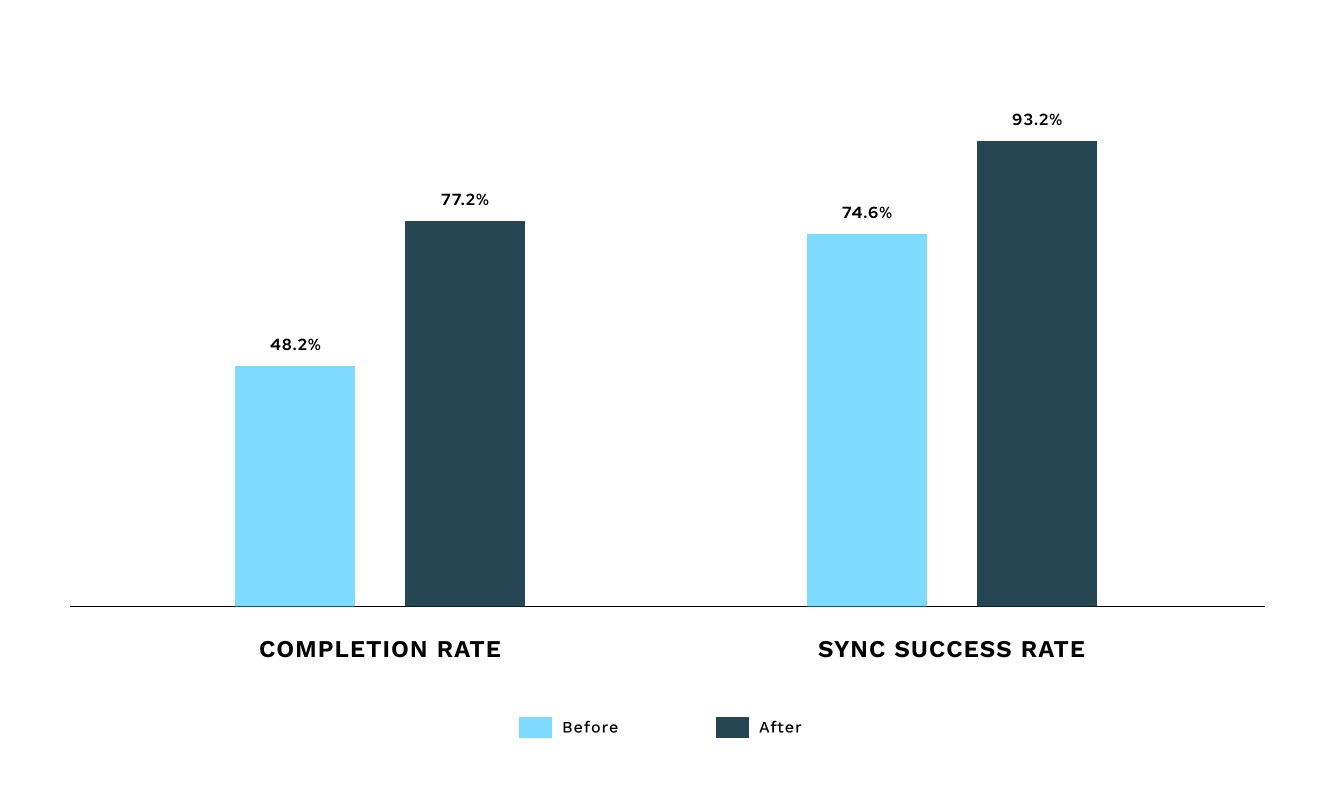
Improvements in performance metrics after redesign.
Next Steps
Future features
One of the best things about a long-term project like this is the backlog of features and future releases we can look forward to. So far, some ideas that have already taken shape include data driven templates, smart follow-up reminder intervals, generating forms from PDFs, and multilingual support.
Generate a form based on an existing PDF.
Learnings & Challenges
This project is a deep look into balancing customizability with usability. Through iterative testing and user feedback, I was able to develop designs that were intuitive while accommodating a range of industry-specific needs. Employing an impact-effort framework enabled me to practice better strategic prioritization, ensuring that design and development efforts were focused on features with the greatest user and business value.
Leading the project end-to-end made me more confident in my ability to manage the full UX process, from initial research and user interviews to design execution and testing. Presenting findings and recommendations to key stakeholders, including product leadership and customers, sharpened my ability to communicate design rationale clearly and align user needs with organizational goals.
This project has been my long-term focus at Henry Schein One for over a year, throughout which I have grown continuously to the point where I can now look back at early iterations and recognize flaws and gaps much more easily.
I hope that the next time a dental form arrives in your inbox, I’ve contributed to making that experience easier and more enjoyable.